Grayscale Testing
Greyscale testing involves converting the design to greyscale and then asking yourself or someone else whether there are any elements that become indistinguishable or difficult to identify. It's crucial for designers to continuously assess for color dependency throughout the design process, not just as an afterthought. Identifying color reliance early on helps prevent a cascade of subsequent issues that require rectification.
UI Elements - For UI elements of any color, integrate various color accessibility techniques to create a design that's robust and user-friendly for all. Examples of the various tactics are listed below.
- Non-color styling: Different patters, dashed line styles, shapes, text styles, border/line thickness, iconography, labels, size
- Relative luminance: Where each color has a 3:1 contrast ratio with the other colors of the color-coded part of the data visualization. A monochromatic color scheme (all shades of 1 color) can make this easier to achieve when you have a lot of colors.
- Non-color styling on hover and keyboard focus: A text link gains an underline on hover and an outline glow on keyboard focus.
- Color for color-coding: Use color as a secondary visual cue because it helps people without vision impairments.
This page contains various techniques and examples.
Error Messages
Error message styling tips:
- Work in black-and-white first (don't add any red until you're done). This will ensure we don't rely on color to visually convey that there is an error.
- Use a thicker border around the field with an error. If the border is red, but not structurally different in any other way, the design will be reliant on color to convey meaning.
- Place the error message and any helper text below the field label and above the input field (and ensure the error message includes instructions on HOW the user can fix/get out of the error). This way screen readers will read the error message or helper text before getting to the input field.
- Use line, shape, or iconography to call visual attention to the area of the error message. We can't rely on color to make the error visually obvious, so we need to add something else to do the job.
Error Message Examples
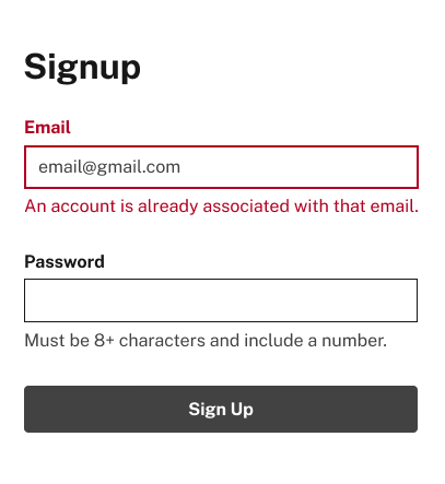
When turned grayscale, the error state below looks the same as the normal state, and the error text looks like helper text.
Below is a set of examples showing a set of changes and updates to the Signup form to improve the accessibility and pass the greyscale test.
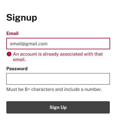
Example 1
The thick border and added icon now make this design independent of color. But the error text isn't very helpful — it should tell the user how to fix the issue.
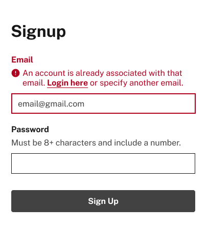
Example 2
Put the error message and any helper text directly above the field label so screen readers will read them before getting to the corresponding input field.
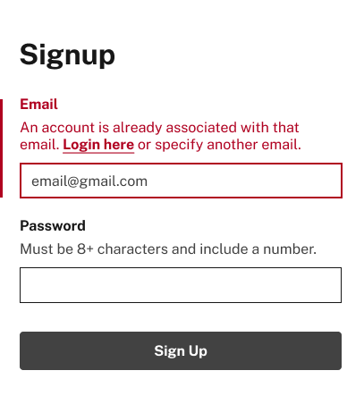
Example 3
The icon was removed and a red vertical line was added.
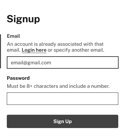
Example 4
Now when turned grayscale, we see the error state is now distinguishable even if you couldn't see color. This passes.
Current Menu Item
Styling the current Menu item - or sometimes the current nav item:
Note:
The term used for the menu item currently selected in the main navigation bar atop the website is referred to as the "current state," not the "active state." This nomenclature is consistent with the code implementation. "Current" denotes a navigational state, specifically indicating the user's current location or orientation within the navigation structure, applicable to elements such as menus, breadcrumbs, and progress trackers. Additionally, distinct from navigational states are interaction states, which encompass behaviors like "selected," "active," "pressed," and "hover," typically associated with buttons and links.
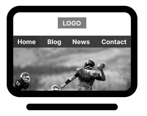
Below is an example of the main nav of a website and along the top is some menu items. 'Home' is styled differently which tells us that it's the current page. A prevalent design strategy involves selecting colors from a photograph and integrating them into the overall design, fostering a cohesive and harmonious color scheme. In this instance, we utilized the dark blue hue for the navigation bar, sourced from the tones of the players helmet, and the natural brown shade for the current state, inspired by the football. This method of deriving colors from imagery is a widely employed technique for crafting a balanced color palette.
Main navigation before
This webpage example shows the label "Home" is the current page.
Main navigation greyscale
When I put the page through the greyscale test you can barely see what the current active.

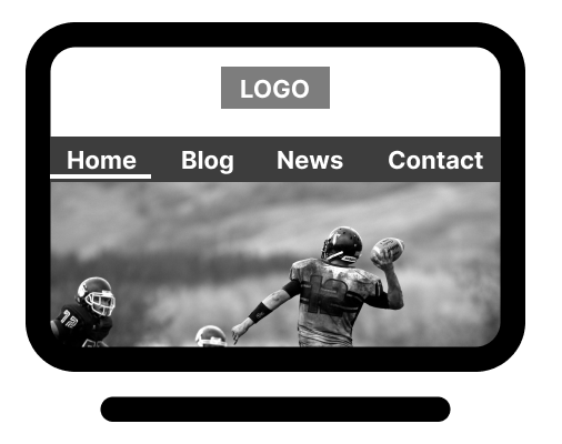
Main navigation after
We're going to use "shape" and in this case the shape is going to be a line that we add under the label. We're no longer using color to convey which menu item is the current one.
Main navigation grescale
Putting this image through the greyscale test shows the yellow underline has sufficient color contrast with the navy blue to stand out. It also passes the WCAG criterion that says single-pixel underlines are not sufficient.

Current menu item styling tips:
- Style the currently selected menu item with a color independent indicator (not just a color change), or use relative luminance.
-
Use a non-color indicator such as shape, line, text treatment, size, etc., instead of changing
only its color.
- Note 1: This can be done in addition to a color change.
- Note 2: Single-pixel underlines are not sufficient. A non-color indicator creates a current state that's visible by all and more usable for all.
- Use relative luminance (where the currently selected state has a minimum 3:1 contrast ratio with the non-selected state of the other menu items). This heightened contrast between the currently selected and none-selected items will make their difference more visible, even in grayscale.
Page Links
For links that have surrounding text, underline them; for links that are standalone, use bold.
- Switch the design to grayscale. Are the links clearly distinguishable or do they appear indistinguishable from non-clickable text? They ought to stand out. While some users navigate by clicking on every element, others opt for visual scanning and scrolling. We cannot presume that everyone will engage in extensive clicking during exploration. Therefore, by ensuring that interactive elements are readily discernible at first glance, the interface becomes more user-friendly and efficient.
-
Prefer not to underline all links within surrounded text? Consider these alternatives:
- Alternative #1: Utilize bold or another non-color-related text styling that is easily discernible.
- Alternative #2: Implement relative luminance, ensuring the link color maintains a minimum 3:1 contrast ratio with the surrounding text color, and both colors achieve a minimum 4.5:1 contrast ratio with the background color. Text links should acquire an underline or other styling upon hover and adopt a different styling when keyboard focus is active.
- While underlining remains the optimal method, these alternatives aid color-blind users or individuals with vision impairments, including situational ones, in identifying clickable text within a block of content.
- Use text styling (aka text decoration), such as underline, in addition to relative luminance (plus an underline on hover and focus) for even better accessibility, and usability for all.
Fail (in color)
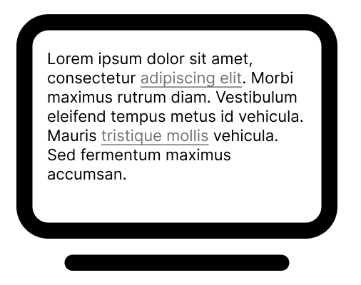
Fail (in grayscale)
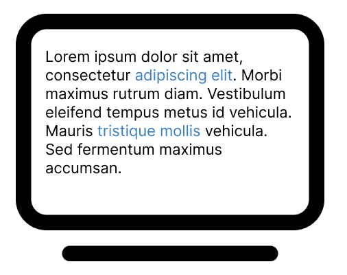

Pass (in color)
Pass (in grayscale)

More Reading
Why your links should never say "click here". From Smashing Magazine.
Progress Trackers / Progress Indicators
When putting together a Progress Tracker/Indicator or similar UI element, design all three states for the steps first (past, current and future) in one shade to avoid using color to convey meaning and then make them visually unique using non-color styling. Then, add color as the secondary visual cue. The purpose of a progress tracker is to provide a comprehensive overview, fostering situational awareness. If certain steps appear faintly colored or disabled, it only presents a partial view, negating the overarching benefit of utilizing a progress tracker.
Example 1
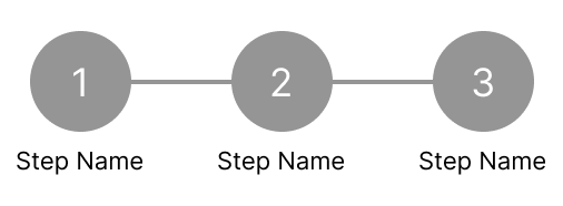
Make everything one color (like black or dark gray) and don't change the color at all until you're done with the structure.
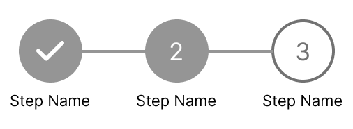
Example 2
Design 2 distinct states: Past, Current, and Future. Style each to be visually different from the other two, without using color.
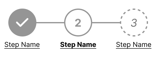
Example 3 (design idea)
Here are a couple of different examples of what a Past, Current, and Future might be styled. Dotted/Dashed strokes, hollow circles, underlined links etc.
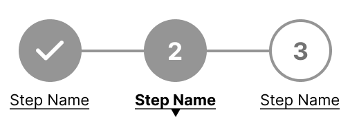
Example 4 (design idea)
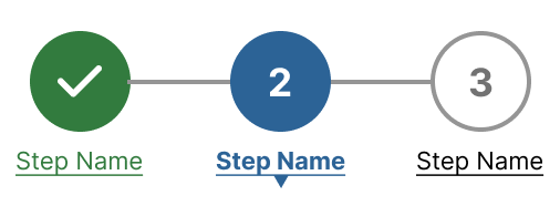
A down-pointing arrow below the step label, or attached to the bottom of the circle
Example 5 (color version)
A splash of color to finish things off. Don't forget to test the colors with a variety of backgrounds.
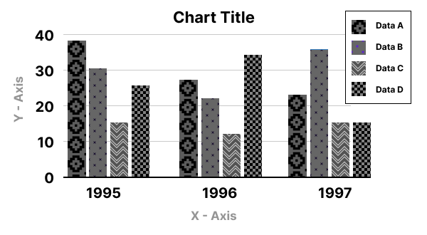
Bar Charts and Similar Data Visualizations
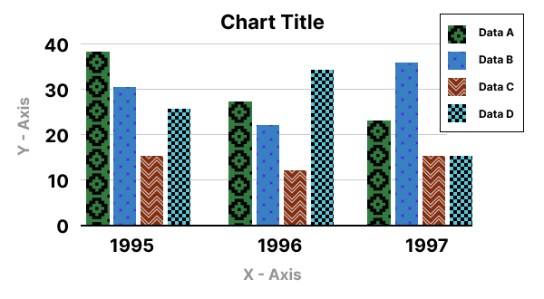
Pattern fills work best here along with strong colors to convey the data. I've included a few examples below of the various data visualization examples. Remember to test.
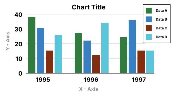
Example 1 (Fail in color)
Make everything one color (like black or dark gray) and don't change the color at all until you're done with the structure.
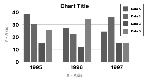
Example 2 (Fail in grayscale)
Design 3 distinct states: Past, Current, and Future. Style each to be visually different from the other two, without using color.
Example 1 (Pass in color)
Example 2 (Pass in grayscale)
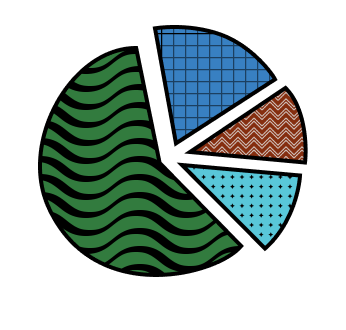
Example 1 (Pie Chart pass)
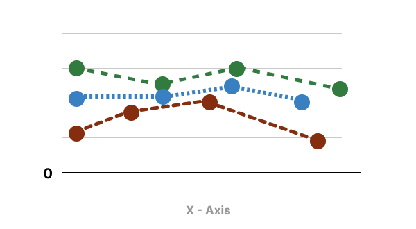
Consider elements like points on line graphs, nodes in node graphs, bubbles in bubble charts, or shapes in organizational charts, Gantt charts, or bar/column charts.
Example 2 (Line graph pass)
Expand your thinking beyond basic shapes. For instance, explore the versatility of rectangles—experiment with variations like a rectangle with a clipped corner, one with a rounded corner, a column with a picket fence top, or a scalloped top.