Error Messages
Error Message Wording
When designing error messages for HTML forms, it's crucial to prioritize clarity and accessibility to ensure a smooth user experience. Firstly, error messages should be concise and specific, clearly indicating what went wrong and how to fix it. Avoid technical jargon and use plain language that's easily understood by all users. Additionally, ensure that error messages are presented in a noticeable manner, such as through color contrast or prominent placement on the page. From an accessibility perspective, provide alternative methods of communication for users who may not be able to perceive visual cues. This could include using ARIA attributes to communicate errors to screen readers or incorporating descriptive text alongside any visual indicators.
Always strive to offer helpful suggestions or instructions for resolving errors, guiding users towards a successful form submission. By following these practices, you can enhance the usability and inclusivity of your HTML forms.
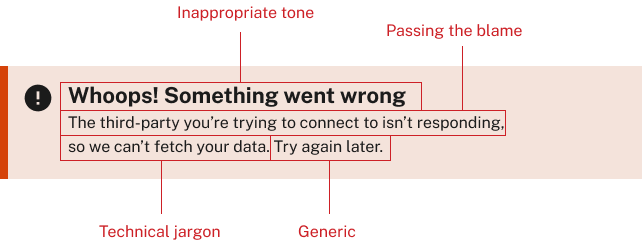
An example of bad error message text is below. Try to avoid the items listed below:
- Inappropriate tone
- Passing the blame
- Technical jargon
- Generic text
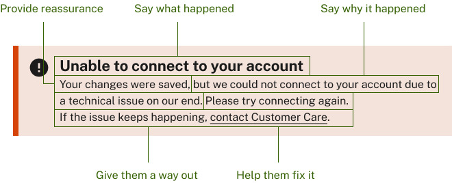
At the very least say what happened and say how to fix it.
An example of a good error message text is below. Try to use these best practices when configuring the error message specifics.
- Say what happened
- Say why it happened
- Provide reassurance
- Give them a way out
- Help them fix it
 Back to top