Link Wording
Specific best practices apply to the wording of links and similar clickable elements, such as breadcrumbs and menu items.
WCAG guidelines prioritize user experience by emphasizing that link text itself should clearly communicate the link's purpose. This means crafting clear and transparent wording that signals both the destination (where the link leads) and the action (what happens when clicked).
Think of transparency as a two-part equation: Transport reveals where the link takes you (another page, form, modal, etc.), while Trigger specifies the action that occurs upon clicking (opens a menu, downloads a file, etc.).
While surrounding text can offer context, it's best not to rely on it solely. Strive for clear link text that empowers users to understand the link's purpose at a glance.
Let's Ditch "Read More"
Vague phrases like "Read More" fall short in this regard. They lack specificity and belong in the category of non-specific link text. Instead, craft descriptive link text that informs users about the destination or action without requiring them to rely on additional context.
Using "read more" or "continue reading" and "learn more" should not be used for 3 reasons.
- Decreased over usability
- Decreased accessibility
- Negatively impact the search engine performance
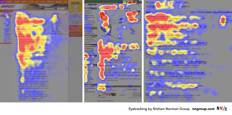
Eye-tracking studies reveal that users instinctively scan web pages for clickable elements such as links and buttons. Therefore, it's vital for clickable elements to be visually noticeable, as users typically allocate only a fraction of a second to read them.
Research indicates that users typically read only 20 to 28 percent of the content on a webpage. As they scan the interface, they follow what's known as the 'information scent,' searching for keywords that may lead them closer to their desired content. This process, termed 'information foraging,' relies heavily on clickable elements like links and buttons, which serve as pathways to more information or desired actions.
In essence, users prefer a streamlined experience that minimizes mental effort and facilitates efficient navigation, rather than one that requires unnecessary cognitive processing.
Screen Reader Users
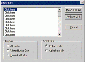
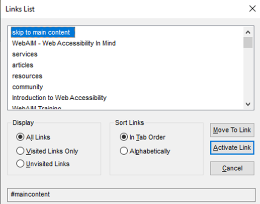
Something screen readers can do is provide users with a list of links pulled from the page the user is on. It comes up in a pop-up similar to the one below, and it's just a list of all the hyperlinked text on the entire page.
Bad Example
A bad example is the image above showing all the links as "Click here", the user wouldn't know where to go or what the links actually took you to.
Good Example
A better example shows the skip to main content and clean indicators of the links on the page.
Sighted users don't want to read the entire page and screen reader users don't want to either.
Smashing Magazine's YouTube channel has a very in depth video showing a screen reader user surfs the web. Definitely worth checking out to see it in action. I've time stamped the video to the start of the presentation.
Avoiding "Click Here"
One reason to steer clear of using "click here" is its implication that users are limited to clicking, disregarding alternative interaction methods like tapping, keyboard shortcuts, or voice commands. Secondly, it underestimates users' capabilities, suggesting they need explicit instructions for basic actions. When text is styled appropriately, users intuitively recognize it as a link. Third, "click here" obscures the intended action, necessitating users to rely on surrounding context for clarity. It's essential to be transparent about the destination or action associated with the link to facilitate user understanding.
Writing Superior Links
For improved findability, discoverability, and accessibility, link text should prioritize the most crucial words at the beginning.
Research, including eye-tracking studies, consistently demonstrates that users primarily focus on the first two words of links, headings, and list items during interface scanning. The F-pattern dominates online reading behavior, where users thoroughly read the initial items, forming the crossbars of the F, before skimming down the left side in a straight line.
Nielsen Norman Group conducted a study on link comprehension, revealing the significance of the first 11 characters in understanding a link's purpose. Based on this and related research, it's advisable to front-load link text with key words, ensuring they effectively convey the link's purpose within the limited attention span of users.
Wording Alternatives
A wanted to just show a few examples I found. Get the most important words at the start of our links. Examples in the tables below.
Bad
- Learn How Professional UX Designers Interview Clients
- Click here to subscribe to our blog and get more UX tips and tricks
- To learn more about our work and view samples from past clients, click here
- Click here to request a quote
Front Loaded Links
- Interview Clients Like the UX Pros
- For more UX tips and tricks subscribe to our blog
- View our process and past work
- Request a quote