Signifiers
Signals that communicate an element's intended use. They are clues that indicate an element is interactive in a certain way. Some examples of these signals/clues would be like certain styling, wording, interactivity, animation, placement, orientation, size, sound, pitch, and rate. There are many.
But signifiers are not just visual cues. They can also be auditory. What do you hear when the screen reader gets to that UI element, what do you hear when interacting with a digital product that can accept voice commands and supports back-and-forth dialogue (thinking about like Google Home, Alexa, or Siri). Sound effects are also an auditory signifier.
Perceived Affordances
These are the actions a user perceives as being possible based on how the element is presented.
Between these two terms ("signifiers" and "perceived affordances"), the preferred term to use is
"signifiers." There's a whole lot more to read on where these terms came from and articles that go
into detail regarding human interfaces and usability. You can learn a lot more at the Just
Noticeable Difference website by John Norman.
Wording, Styling, Interactivity
When designing interactive elements for accessibility and usability, it's crucial to focus on three key aspects: Wording, Styling, and Interactive States.
- Wording - Ensure that the text associated with interactive elements clearly communicates their purpose. Effective wording guides users and indicates functionality, helping them understand how to interact with the element.
- Styling - Make sure that interactive elements are visually distinct and recognizable. Appropriate styling communicates interactivity, making it clear to users that these elements are clickable or actionable.
- Interactive States - Consider how interactive elements behave in different states. They should respond appropriately to user interactions, such as hover, focus, and click states, providing feedback that reinforces their interactivity.
The term "interactive elements" encompasses a wide range of components, including buttons, links, sliders, carousels, cards, tiles, checkboxes, radio buttons, dropdowns, menus, breadcrumbs, progress trackers, and drop zones, among others. Each of these elements requires careful attention to wording, styling, and interactive states to ensure an inclusive and user-friendly experience.
Button Wording
Use verbs (action words) and facilitate efficiency!
When buttons trigger an action and are labeled with an action word, users feel more assured and confident in clicking them because it's clearer what action will be triggered.
Opinion
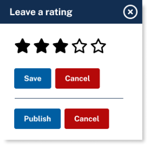
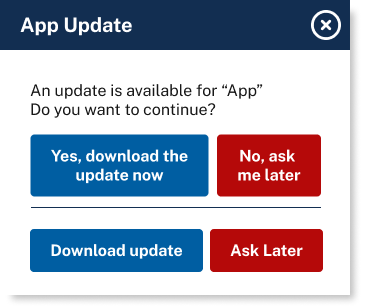
So, this might be a controversial opinion but in a dialog box or modal I always put the "positive" outcome first. For two reasons:
- When the modal/dialog box appears, generally the user wishes to "move forward" and accept the positive outcome (Save, Publish, or Download Update)
- When tabbing, its quicker! The first option is already highlighted (active) and for screen readers its read out first after the dialog.
Examples:
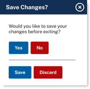
Buttons labeled "No" and "Yes" are not effective calls to action because users can't commit to a choice without first taking time to mentally ensure they understand what "Yes" signifies and what "No" signifies.
This best practice applies to the wording of any action triggers, illustrating the importance of clarity and specificity in labeling interactive elements. (Save / Discard)
The first set of buttons is generic and vague, lacking specificity about the action they will trigger. The second set is more task-specific, clearly indicating what action will occur upon selection.
Try to eliminate the button "Submit" entirely from your website or app.
This isn't efficient to get through. Changing the wording to make it more concise makes it efficient, simple, streamlined, and to the point. Much better in regards to accessibility.
Screen reader users hear everything read aloud to them. So the shorter the text, the faster a screen reader user can navigate through the interactive elements on a page.
There isn't a specific rule for the minimum or maximum length of a text label. The general advice is to keep links concise, using only as many words as necessary to convey the intended message effectively.
Back to top